By now, many of you may have seen how some LinkedIn posts look a bit different than what you’re used to.
But what changed on LinkedIn — and why? And for executives or marketers managing their company executive’s personal social media accounts, how will this update impact your content moving forward?
How and Why Did LinkedIn Change Its Organic Post Preview?
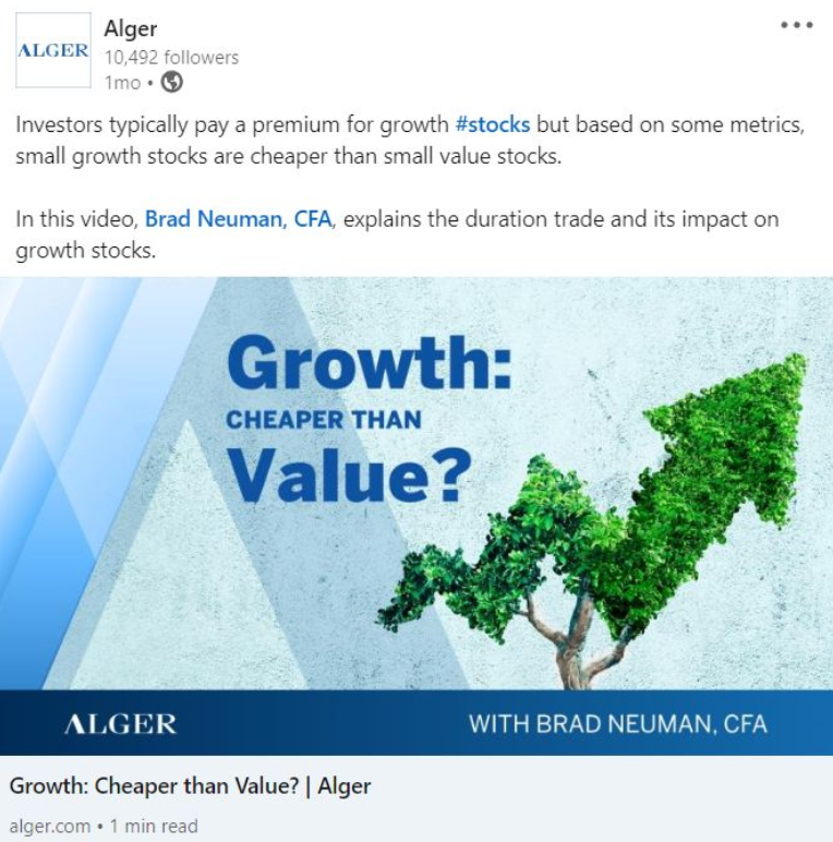
First, let’s discuss what the change was. Previously, when you shared a link in a post, it looked like this in a social media feed:

After LinkedIn’s update, organic posts now look like this:

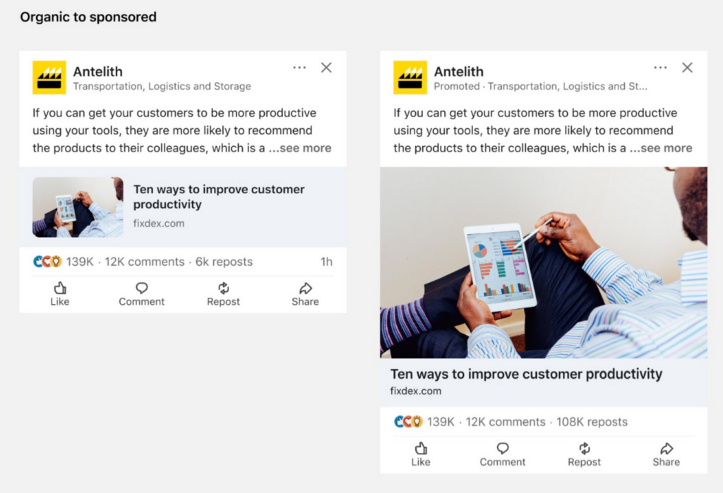
The section you see in gray below the post text — the “autopopulated link card” or “link preview” — is now much smaller. The image has been scaled down significantly and is on the left side of the article title.
While organic posts shared in your LinkedIn feed may look like the example above, organic posts that have been sponsored will be “upgraded” to the large autopopulated link card preview, as shown below:

Here is LinkedIn’s reasoning for this change:
“To help members stay on LinkedIn and engage with unique commentary, we’re simplifying our feed by changing the image size and third-party article link preview for organic posts and Sponsored Content. When an organic post becomes a Sponsored Content ad, the small thumbnail preview image shown in the organic post is converted to an image with a minimum of 360 x 640 pixels and a maximum of 2430 x 4320 pixels.”
This change also helps drive revenue for LinkedIn as some users may want to spend money on their posts, boosting its visibility to more users on the platform.
How Can Executives Navigate This Change?
Although LinkedIn’s reasoning behind this change was to improve engagement with commentary, at a glance, the new organic post preview doesn’t look eye-catching since visuals are now much smaller. To LinkedIn’s credit, this does mean that the actual text in the post doesn’t have to compete with larger, flashy images.
That being said, in a crowded feed of endless updates, an executive’s post may not stand out — a problem for any executive social media program.
Having a large image may not be as important for certain posts, but what happens if you want to ensure that your post’s visuals catch a LinkedIn user’s attention? For example, let’s say an executive wants to share a custom graphic featuring text that mentions how their company recently won an award. In an autopopulated link card, the text would be barely visible due to the small preview size.
One workaround is to natively upload your image and then place your link in the post copy. Here’s an example:

However, there is a slight downside to this. Native uploads of images, documents, and videos replace your link card. This means that your native uploaded graphic or image can’t be clicked to direct LinkedIn users to another website.
If you want to direct readers to a site, the URL must be placed as a text link within the post copy itself, as shown in the example above with the link to the article.
This also means that while the images are much more visible in this organic post, the link is less visible, especially if it’s at the end of your post hidden under the “…see more” link.
Is LinkedIn Still The Right Platform For Executives?
So, does this LinkedIn update change anything for executives?
Yes and no.
LinkedIn remains one of the most important social media platforms for executives. In our recent study, we found that 98% of Fortune 500 CEOs who used social media were on LinkedIn. The change to the link preview isn’t going to make executives migrate to another platform.
But, it’s important to keep in mind that just sharing a link and having an autopopulated link card will decrease the value of the image in the preview since it’s small and difficult to see. If you’re sharing charts or a graphic with text, forget about it being easily read in LinkedIn’s new autopopulated link card! In this case, we’d highly recommend natively uploading the image and skipping the link card altogether.
Could another social media channel be a better fit for some executives who want to put more emphasis on visual content? Potentially. Instagram posts still prioritize visuals, whether it’s a single image, carousel, or video. A post’s visual and text share relatively equal amounts of screen real estate. That being said, Instagram is a different platform and will require a different social media strategy. This might not be feasible for executives handling social media content on their own, which is why those who want to establish a presence on multiple channels often leverage their in-house marketing team or an external specialized agency.
If you’re an executive considering which social media platforms to use to share company content, or a digital marketer wondering how an executive social media program can fit into your overall advertising strategy, we can help! Click the button below and schedule a one-on-one consultation to learn the benefits of executive social media.


